SexEd Bakeshop
Branding, Experience Design
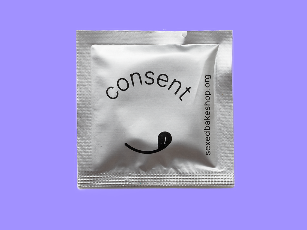
A social practice art project and bakeshop brand expanding access to shame-free sexual health conversations.
The Challenge
After a decade of workshops, exhibitions, and collaborations — including a grant-funded high school curriculum and courses taught at Parsons — the project had no unified identity, limited photography, and a modest budget. As founder Liz Slagus took the project solo, she needed more than a logo: a brand she could run herself, and a visual language that made a taboo subject feel approachable.
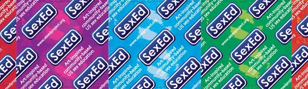
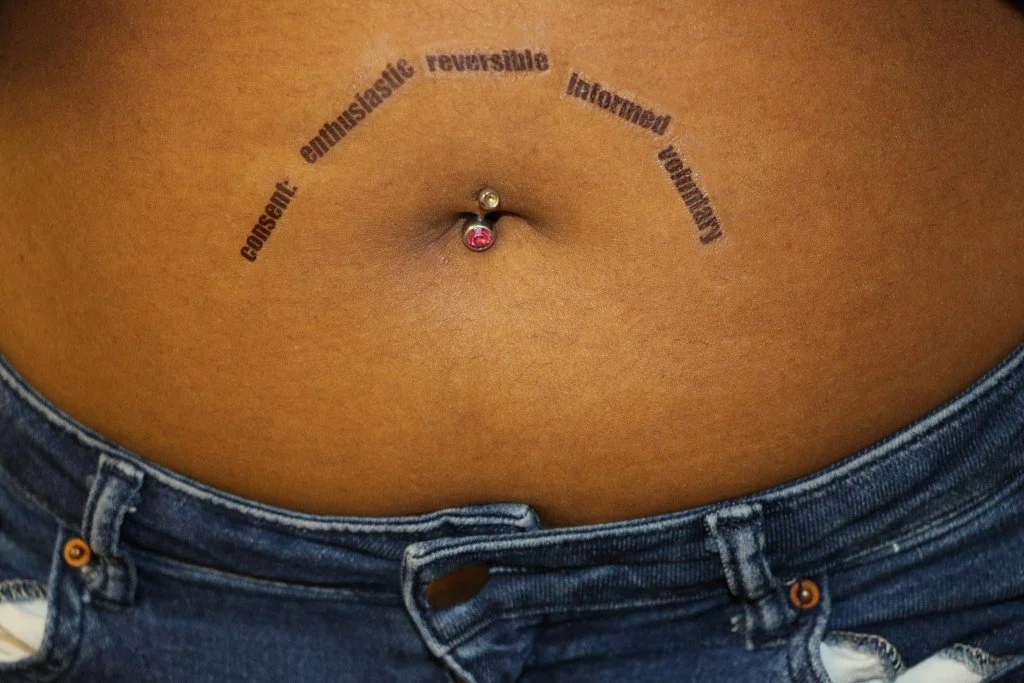
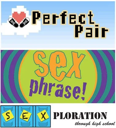

Materials from the SexEd Project
The Process
I began with the archive. Reviewing ten years of doodles, notes, and written fragments surfaced the words that became the tagline: craveable and shame-free — her own language, sharpened. I proposed launching at Coney Island's Mermaid Parade, giving the project a real deadline and sparking Tails of Consent.
Moodboarding
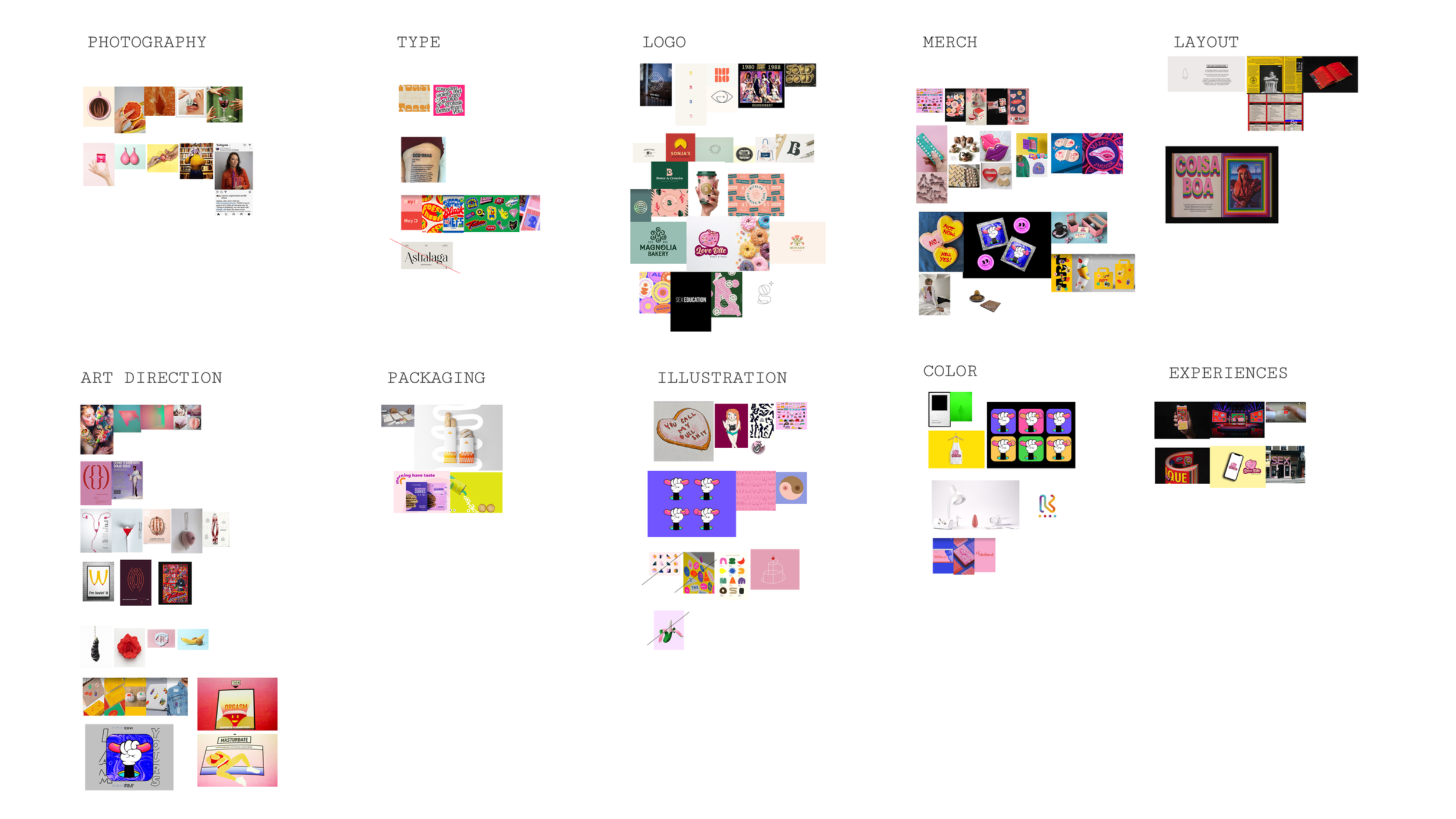
Bird’s eye view of the visual inspiration categorized
Moodboard incorporating original photography and based goods.
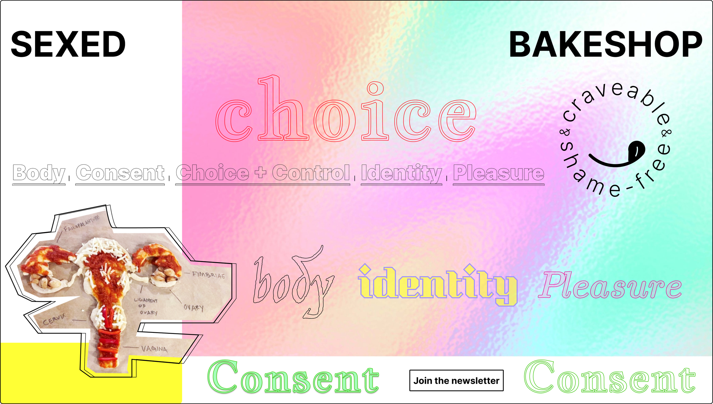
Exploration of tagline, typography and colors
The Process
I began with the archive. Reviewing ten years of doodles, notes, and written fragments surfaced the words that became the tagline: craveable and shame-free — her own language, sharpened. I proposed launching at Coney Island's Mermaid Parade, giving the project a real deadline and sparking Tails of Consent.
Logo Explorations
We explored three identity directions — typographic, hand-drawn, and illustrative — developing both a logotype and symbol.
Exploration 1, Organic Play
Exploration 2, Cake Disco
Exploration 3, Smiley
The Solution
A visual system designed for self-sufficiency, where every choice carried the project's spirit. The typography pairs a clean sans-serif with Jim Nightshade — a kitschy, unexpected display font chosen deliberately: sex education is a topic we don't want to talk about but must, and the type needed to disarm before it informed. Whimsical, not intimidating — turning something taboo into common language. We committed to web fonts from the start, keeping the system free to use and consistent across the site, print, and anything the founder builds next.
The palette carries the curriculum itself: five colors, one for each pillar. Red for body — blood, life, the physical. Yellow for consent — the pause, the check-in. Mint green for control — the go, the confident yes. Lilac for identity — itself a blend, for the flavor that explores who we are and how we shore up our right to express it: pronouns, transitions, rights, all of it. And magenta for pleasure — desire, joy, play. But the pillars don't live in isolation — they merge, relate, and connect — so the system is built on gradients: where the colors blend is where the conversations actually happen.
Brand elements
Cutouts
The photography direction followed the same logic. Working with a limited image library, I created punk-inspired crops of the baked goods — bold, imperfect, appetizing — a style the founder could reproduce herself in accessible tools. When existing photography fell short, she hired a photographer and began studying photography herself.
That's the outcome I design for: clients who leave inspired, empowered by design, and fluent enough in the process to keep building without me.
SexEd Bakeshop “Facts”. Concept for web experience
The Impact
We launched an MVP — brand, website, and event presence — debuting at the 2023 Mermaid Parade. Since launch, the brand has extended into art installations and community activations, and the founder continues building on the visual library — running the complete system independently: teaching, baking, and hosting conversations that are craveable and shame-free.
Site developed by Moonpool. Visit sexedbakeshop.org
My Role: Brand Designer & Creative Direction
Process: Brand identity, visual system design, web design
Client: Elizabeth Slagus / Sex Ed Bakeshop | Year: 2023